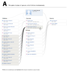
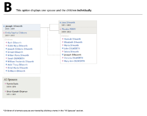
Last week I received an email invitation to take part in a research survey from FamilySearch. It concerned the way information would be displayed for an individual and their family members. It’s easier to show you the two proposed displays than explain them so:
Option A Option B
The questions were all designed to see which view was liked more. I generally favored option A….with a few changes. The first and main reason I favor option A is because it has the most information displayed on it. If you’ve used new. familysearch.org before than you know how much waiting is involved in clicking between individuals and the various view options. Option A largely eliminates the need to click back and forth because the relations are all displayed on one page. Effectively the Parents & Siblings and the Spouses & Children tabs have been merged. For me, this is a good thing. Additionally, all of the selected individual’s spouses and children are also displayed, eliminating the need to click through spouses to see all the children and marriage information. When you hover your pointer over a spouse, the related children are highlighted to help keep it all straight.
What strengths does Option B have? Well, clearly it’s the cleaner view. The many lines clutter up the view, in my opinion. Given the highlighting built in to the option, I don’t think the lines are necessary and option B proves this. However, there is much less information displayed in option B and for me, that’s the difference.
What do you think of the new displays? I’m very interested in your comments.


